Origin
─
Print. Branding
Origin
─
Print. Branding
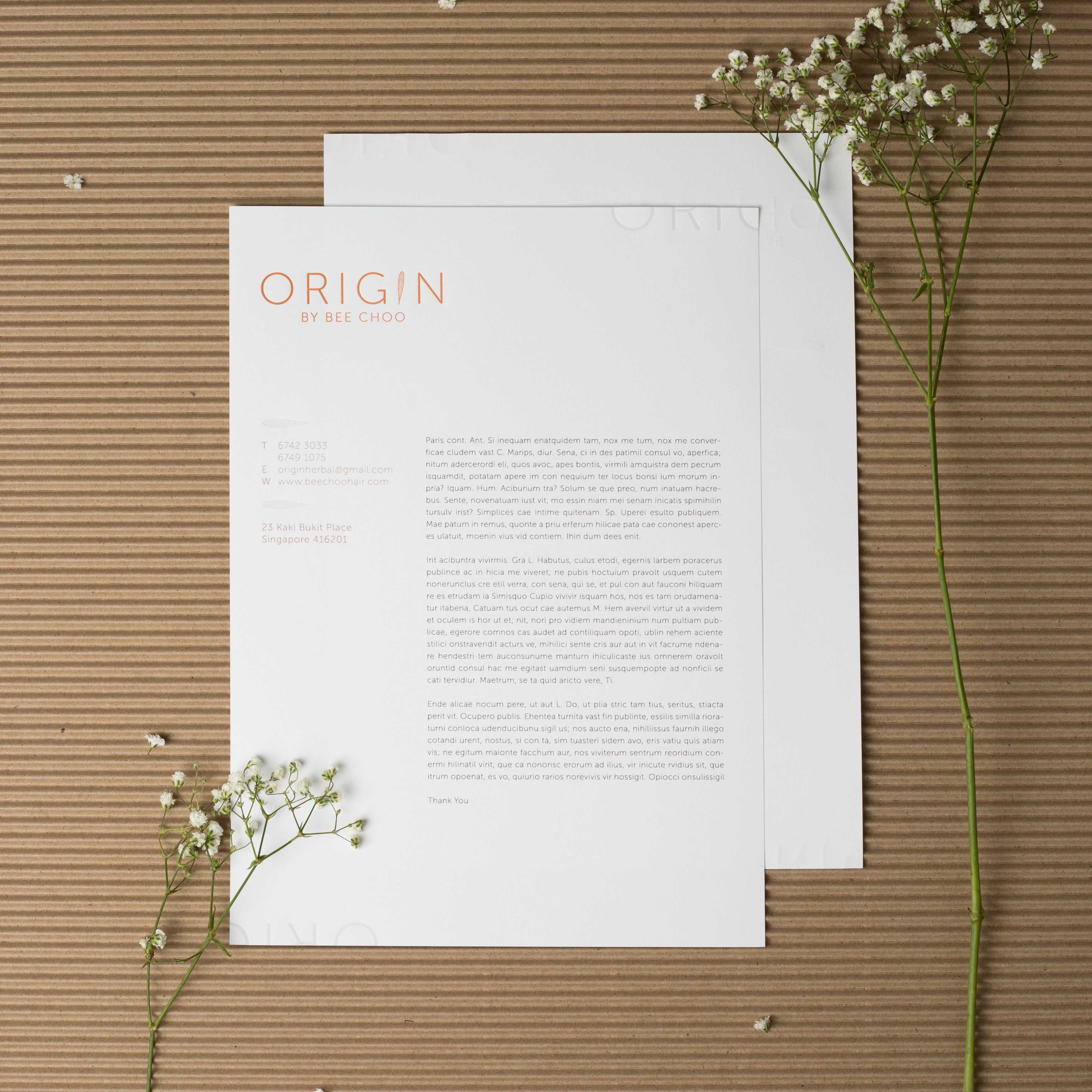
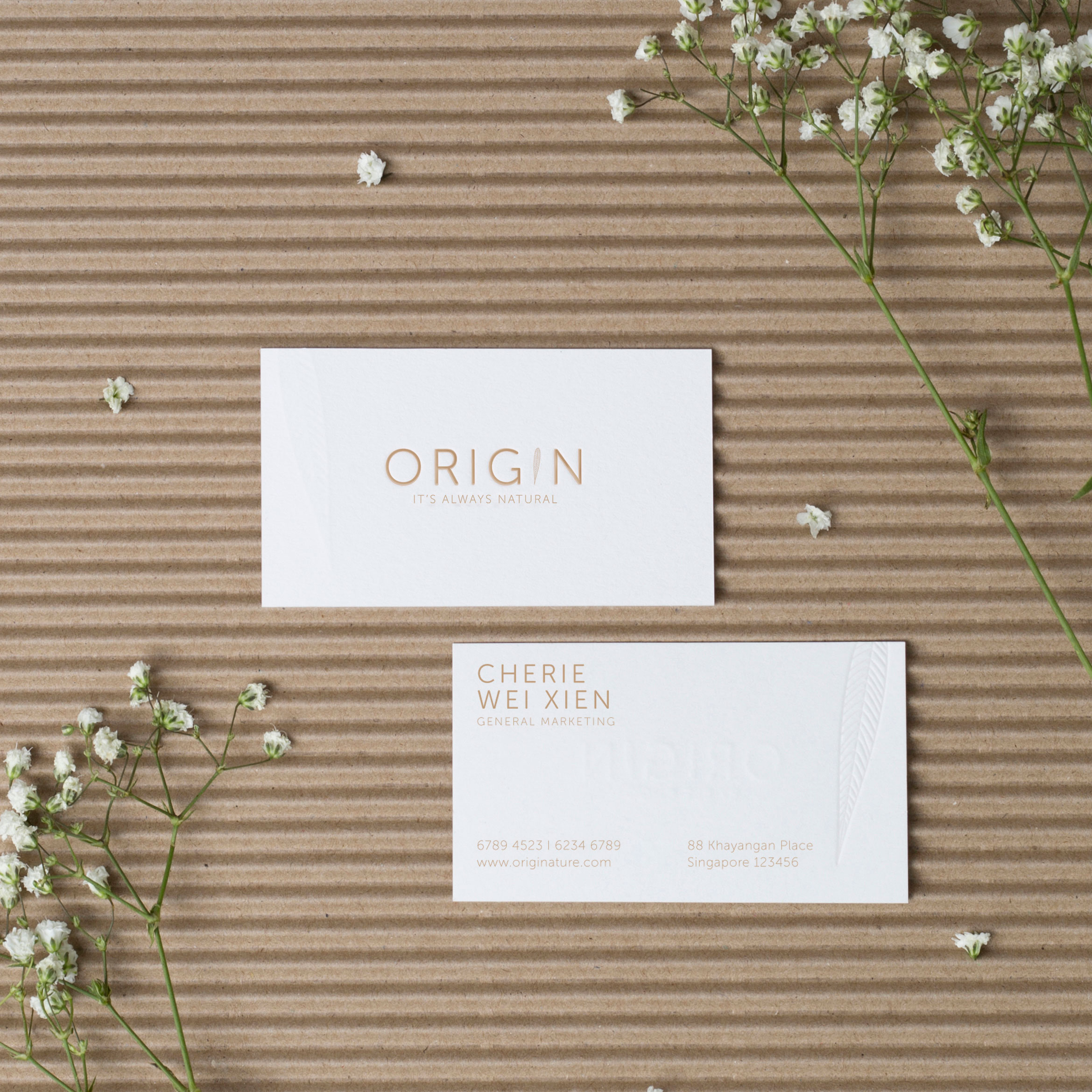
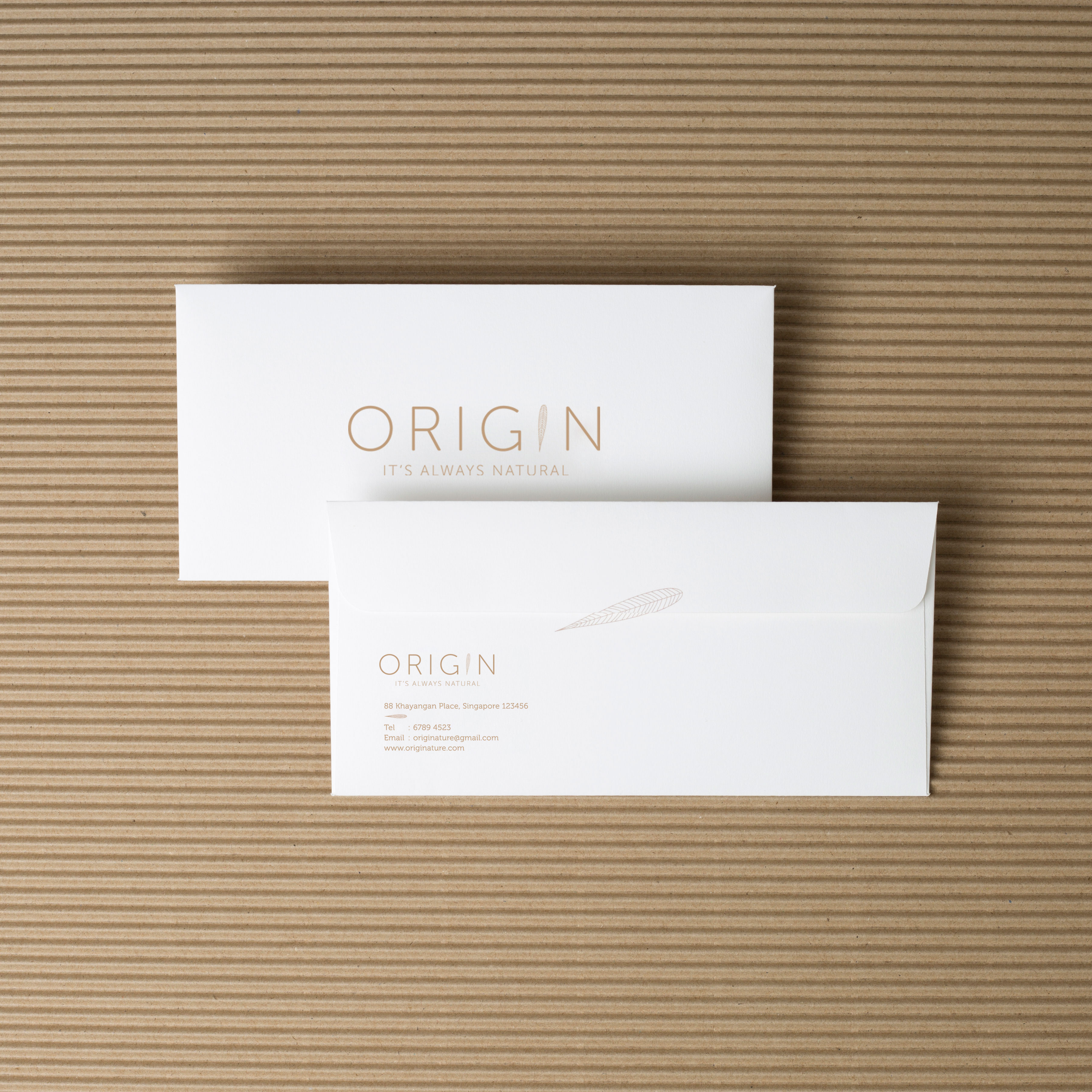
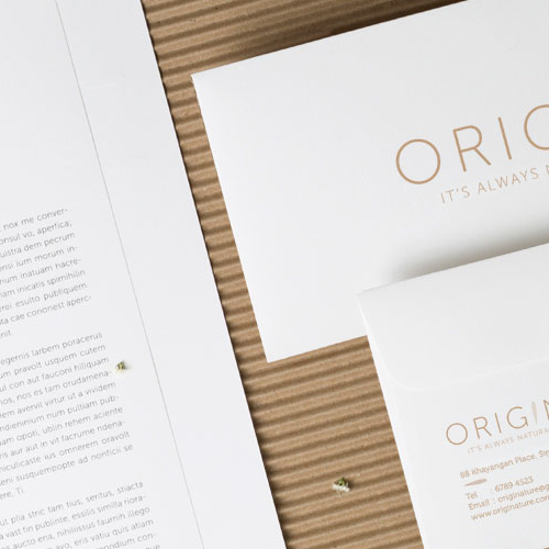
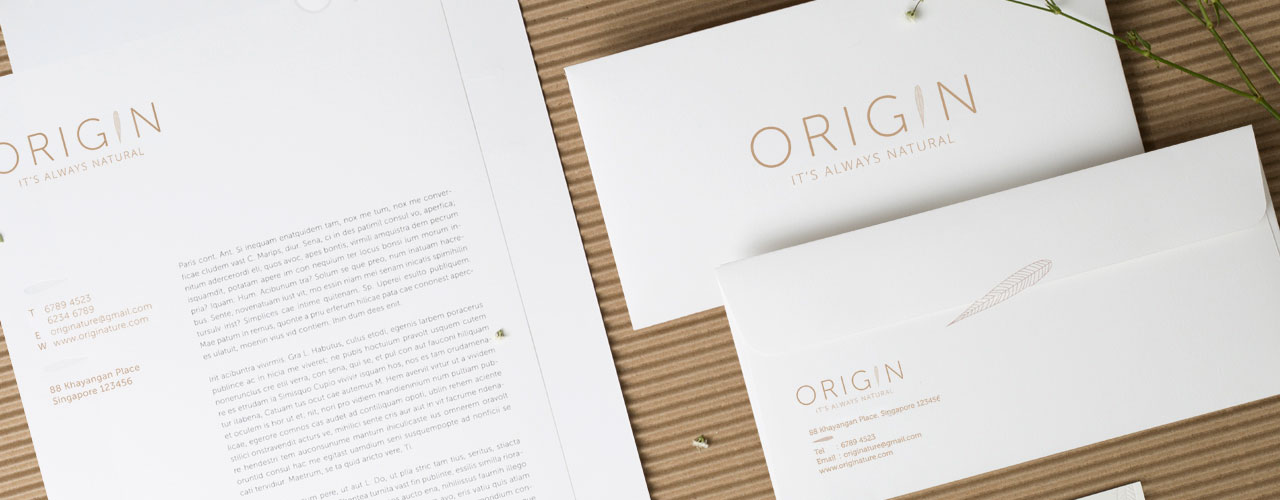
It’s always natural. Branding for a organic shop
Description ─
Our client, Wei Xien, was looking for a branding for her Origin shop. The company is specialized in organic products. The task under the project is to create branding. One of her requests is to not use green as the colour. So we explored other elements of organics, which is an earth tone colour. We decided to go with the light brown colour, as it represents simplicity, organics and naturalism. We use a leaf as a part of the logo to showcase the organics. All the print collaterals are done using eco-friendly materials to showcase the brand value.