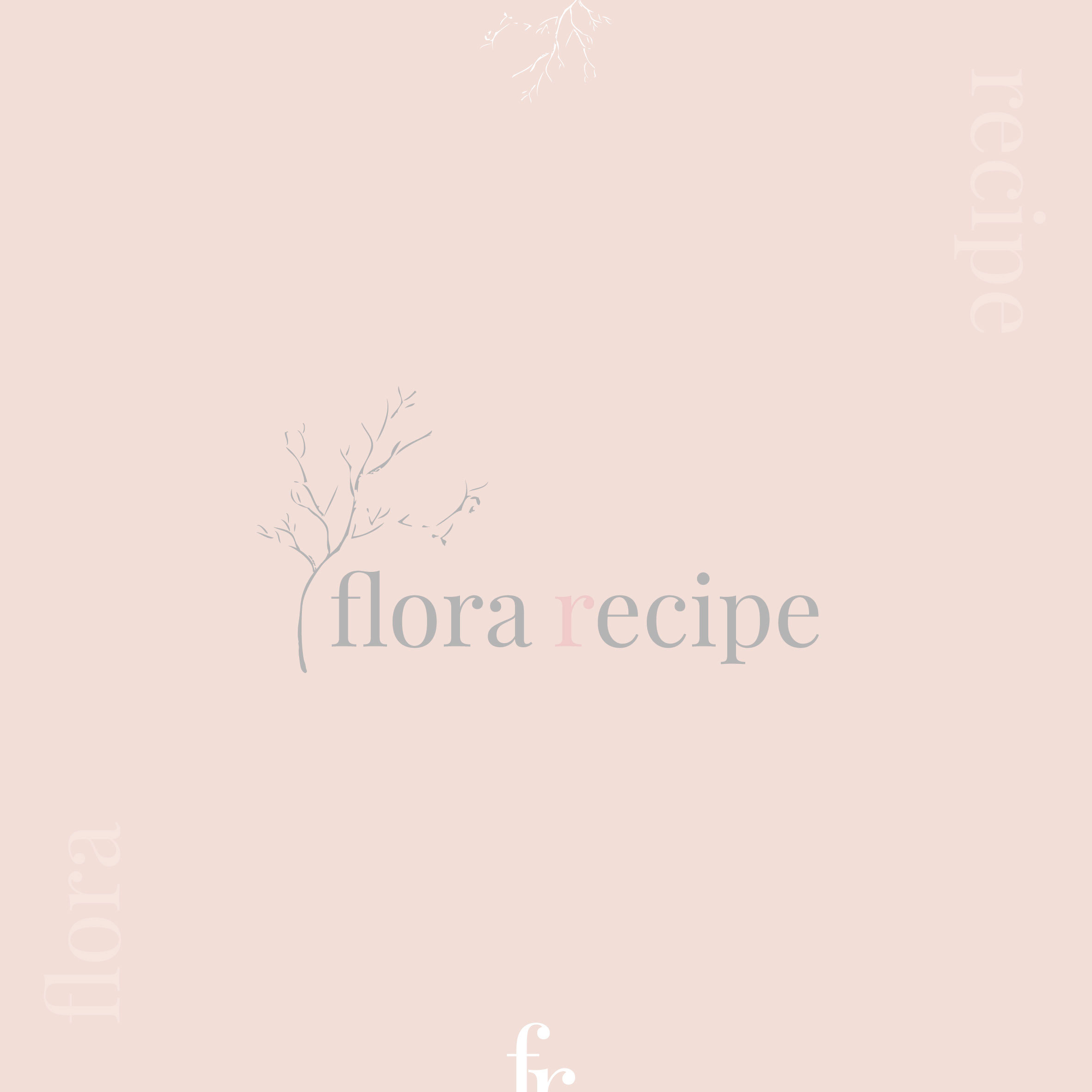
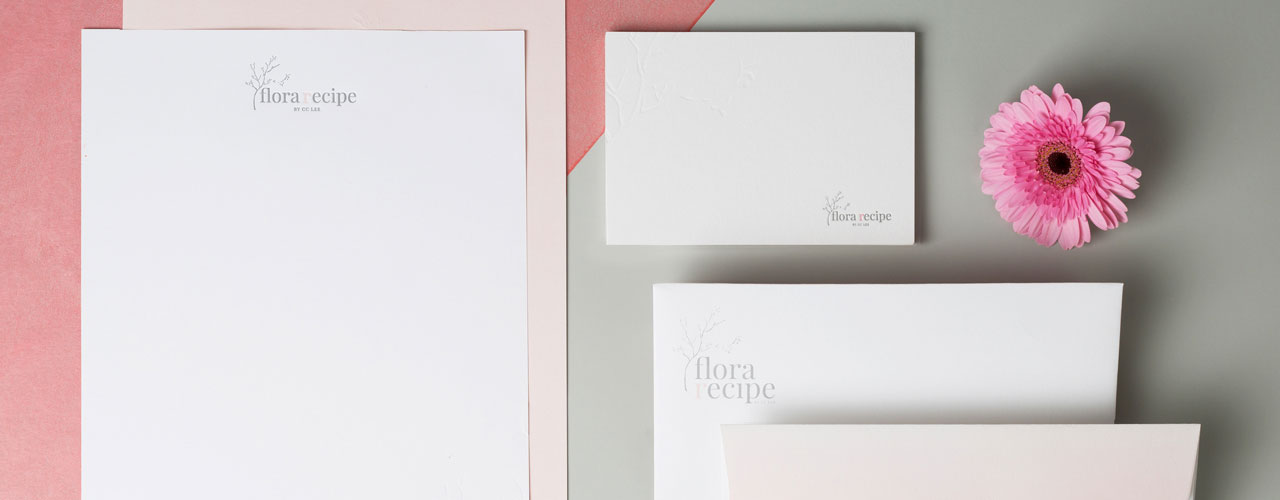
Flora Recipe
─
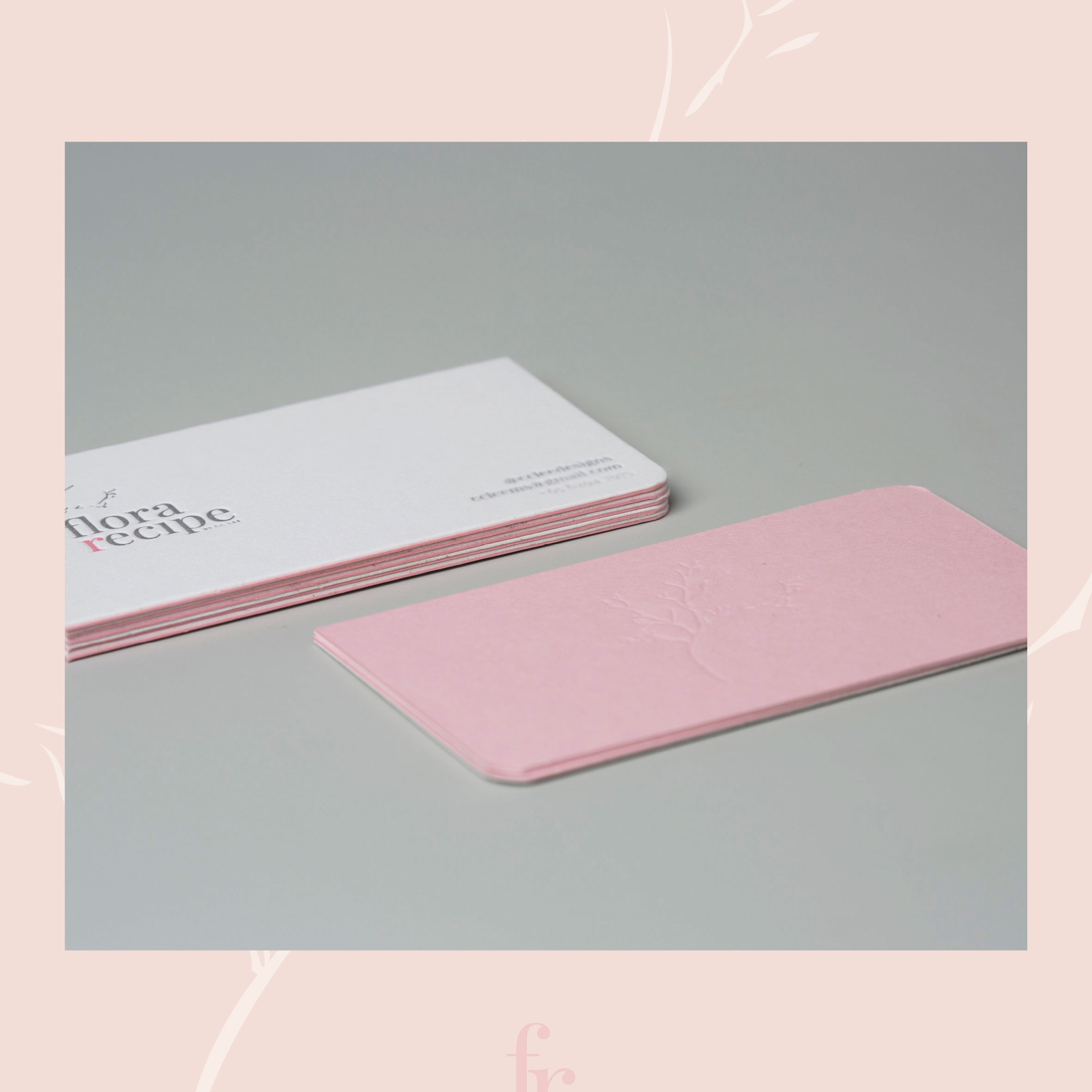
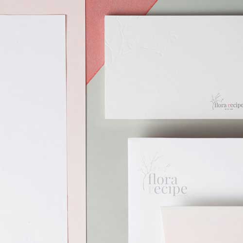
Print. Reranding
Flora Recipe
─
Print. Reranding
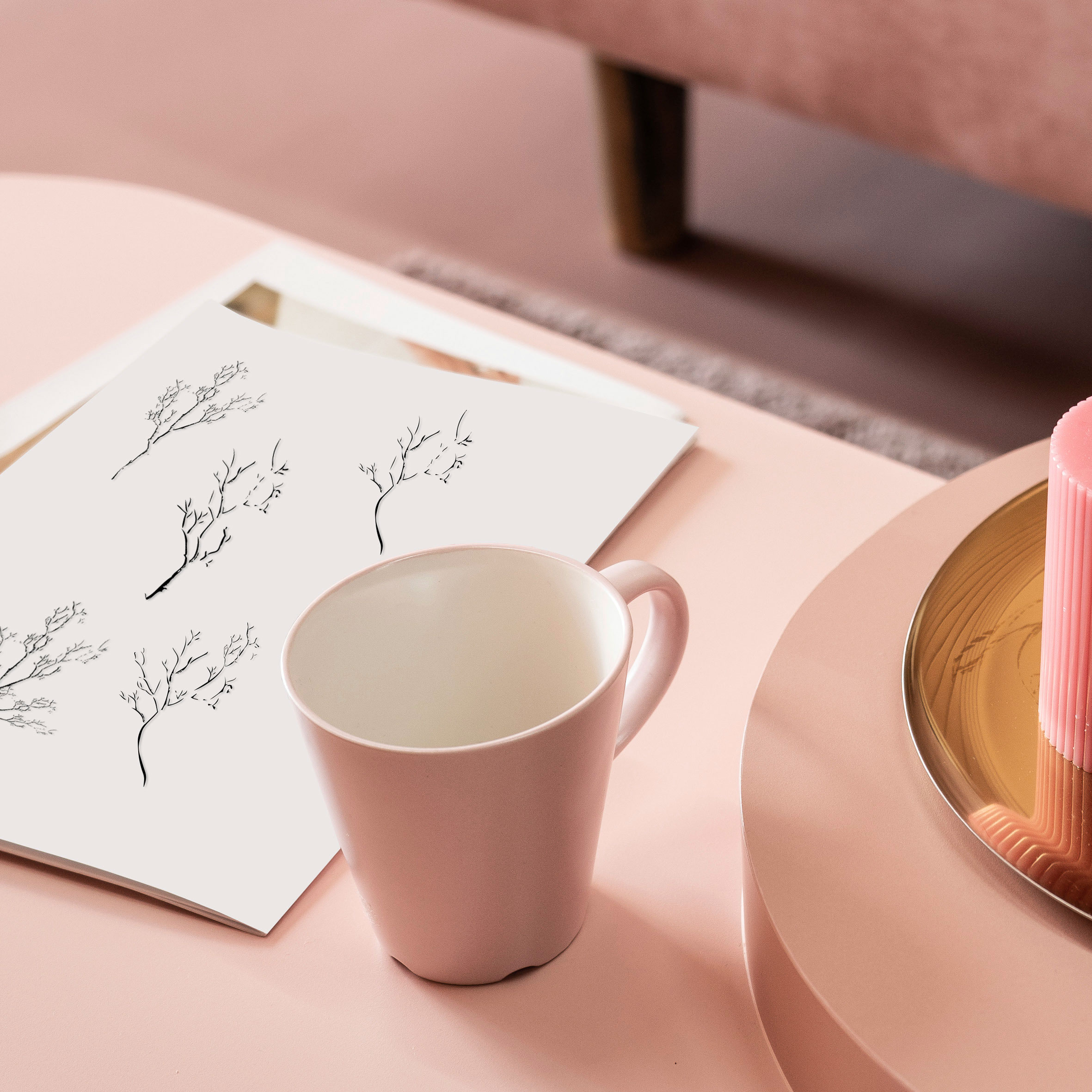
Rebranding, styling stories through flowers.
Description ─
CC Lee Design was looking for rebranding. The client is a wedding and event florist in Singapore. It is a family business. The task is to keep the same value with a new touch and elements. They requested a feminine and soft color, so we decided to use grey as the primary color since it represents classic and timeless, similar to their brand value, and pink as their secondary color as it shows delicacy, romantic, and compassion. The twigs are a new element that they specifically requested to put into the logo.